01 / 06
- Case Number
 001
- Subject of Record
- THE OFFSIDE
- Record
- THEOFFSIDE.CLUB/EN
- Status
- STAGING
- Classification
- WEB
The Offside
IDENTITY05 SW

The Offside is an independent football publication, rebuilt around culture. The work combines a new lettering identity, monumental editorial typography, terrace photography and a bilingual reading experience.
Brand direction, editorial design and full-stack implementation of the reboot, including bilingual routes, reading surfaces and authored motion.
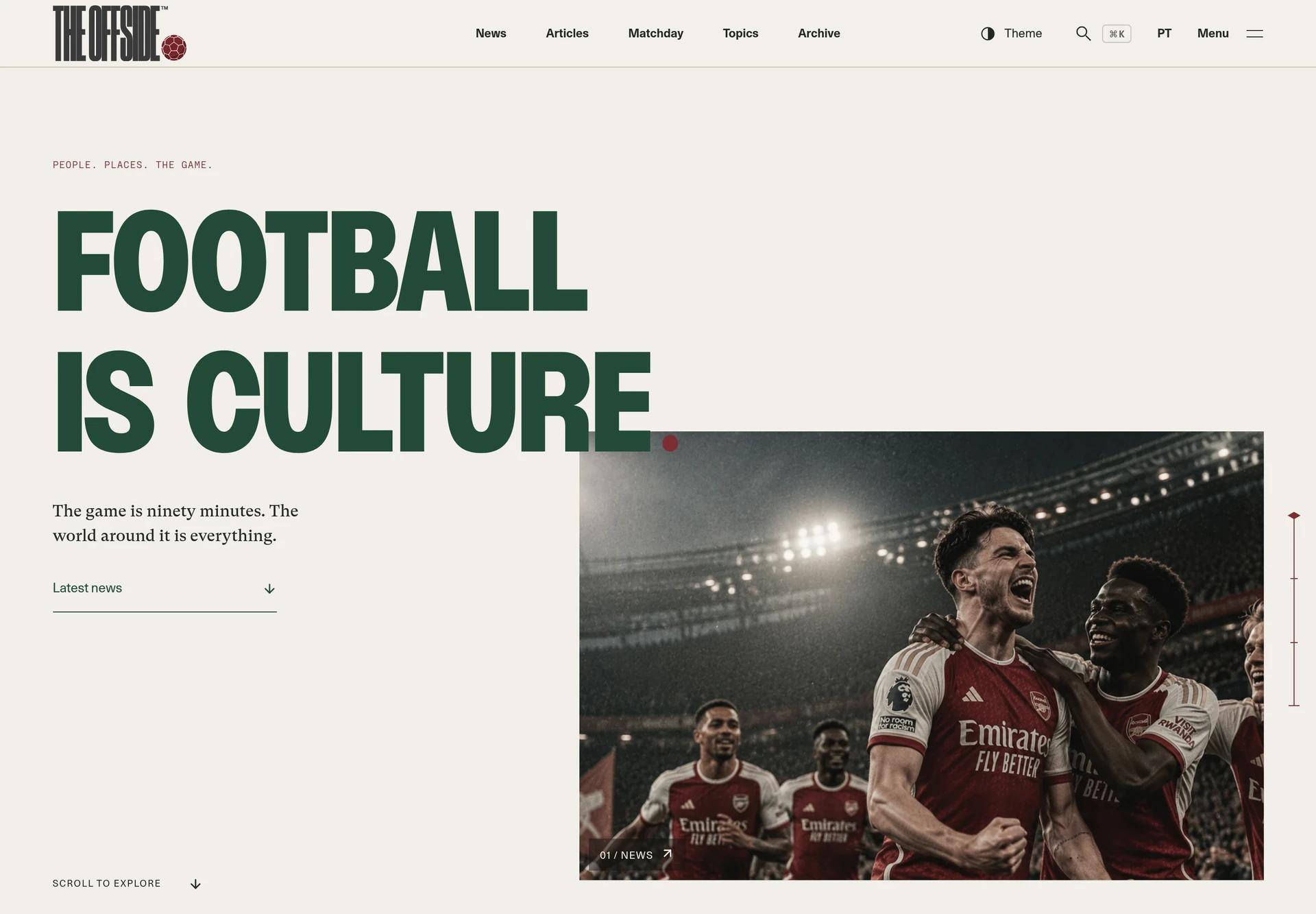
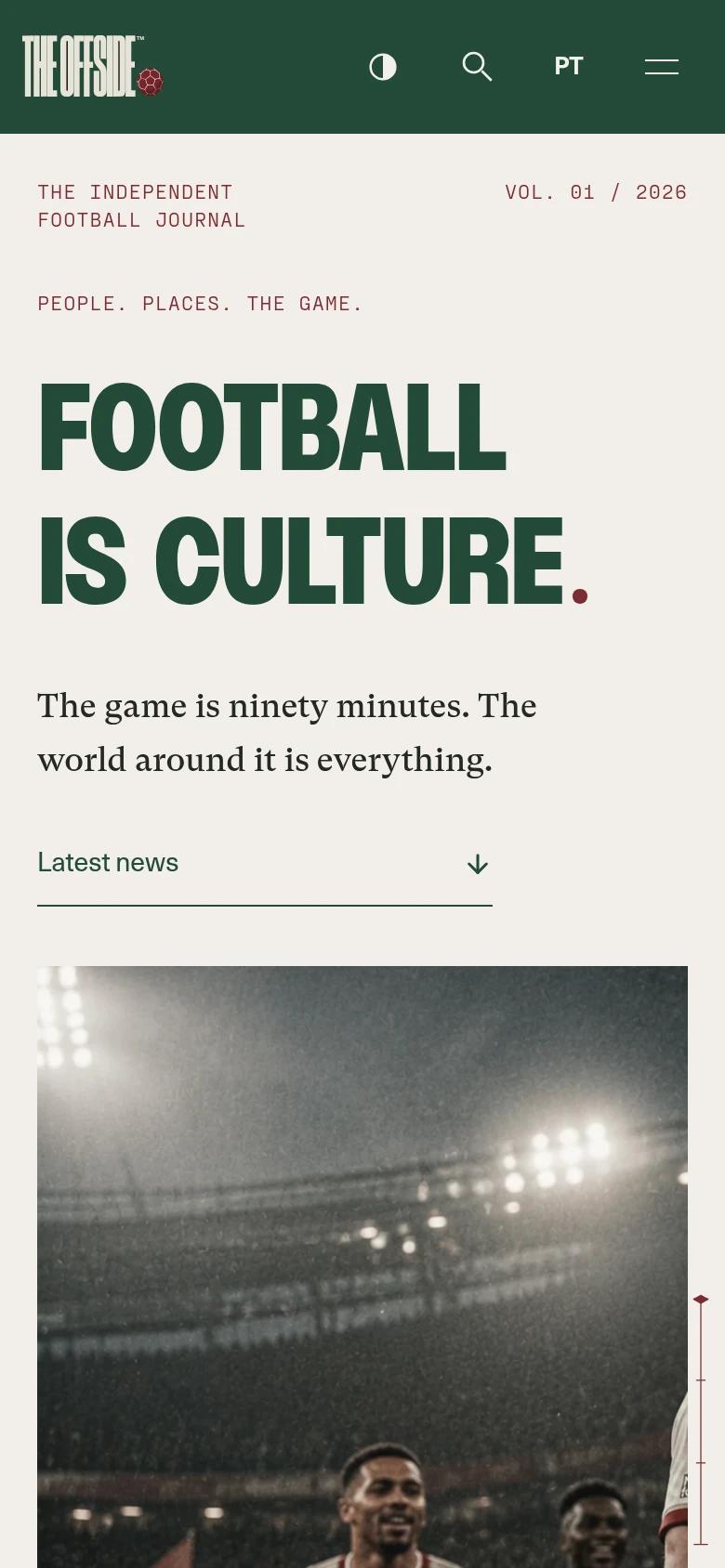
The English cover pairs monumental type with match photography.
CUE 01CONSTRAINT
Football Beyond the Score
The starting point is a publication about the people, places and objects around football. A score alone cannot express that world. The new identity takes its cues from terrace lettering, printed programmes and the scale of a sporting poster.
I rebuilt the public experience around that editorial position: a cover that gives type and photography equal authority, a culture chapter with room to move, and stories that remain comfortable to read.
CUE 02SYSTEM
Lettering With a Point of View
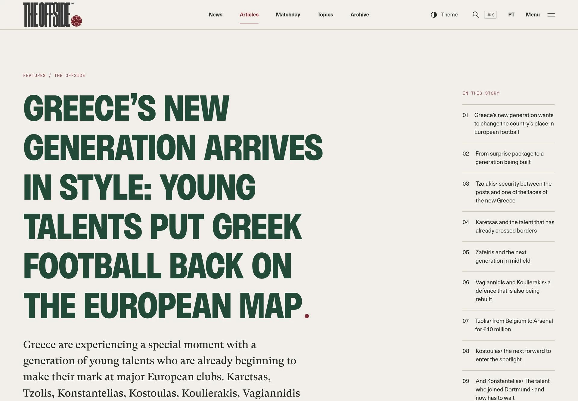
The supplied wordmark is the main identity. Its compressed lettering and oxblood ball remain one multicolour drawing, never a mask or a recreated font. Bottle green gives the publication its voice, bone opens the reading field, and oxblood registers a date, action or sporting detail. Squared lockups and signatures have their own supporting roles.
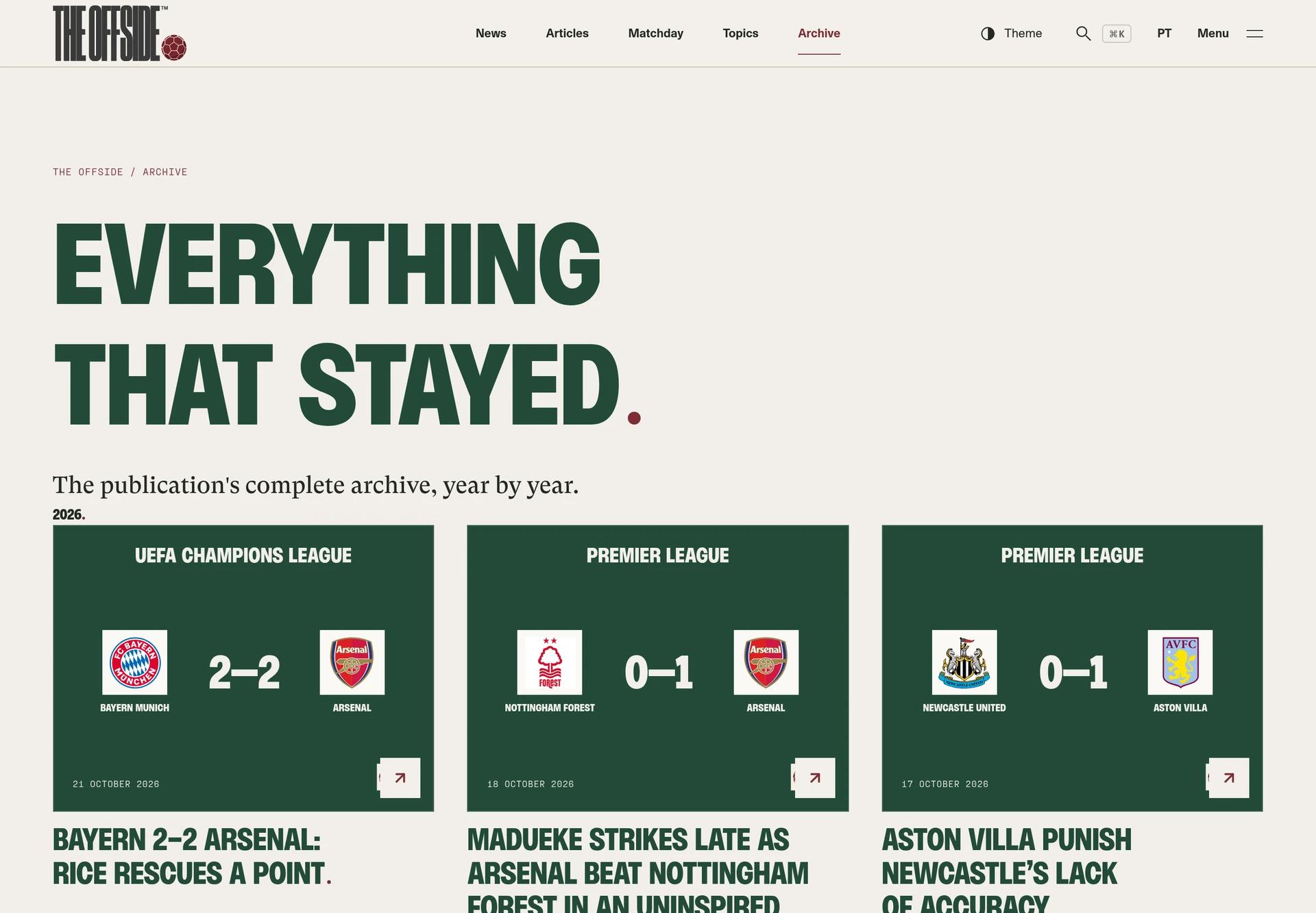
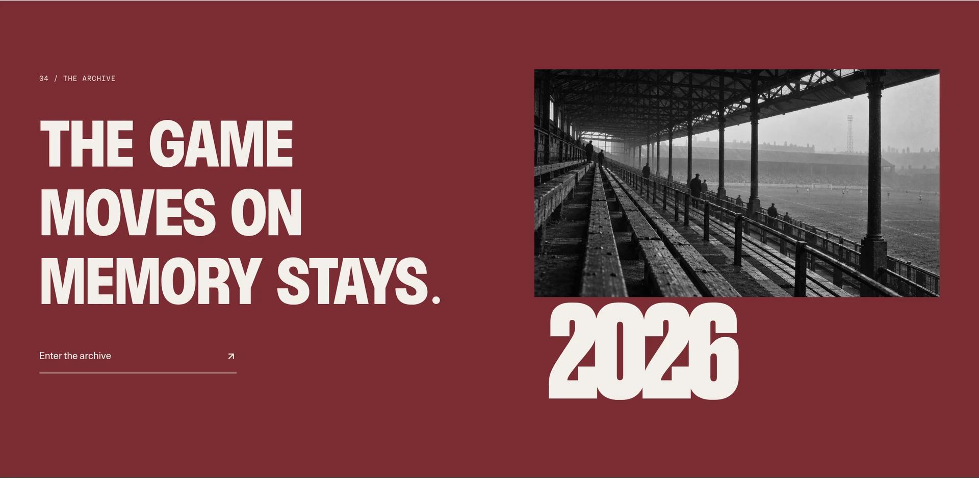
CUE 03EXPERIENCE
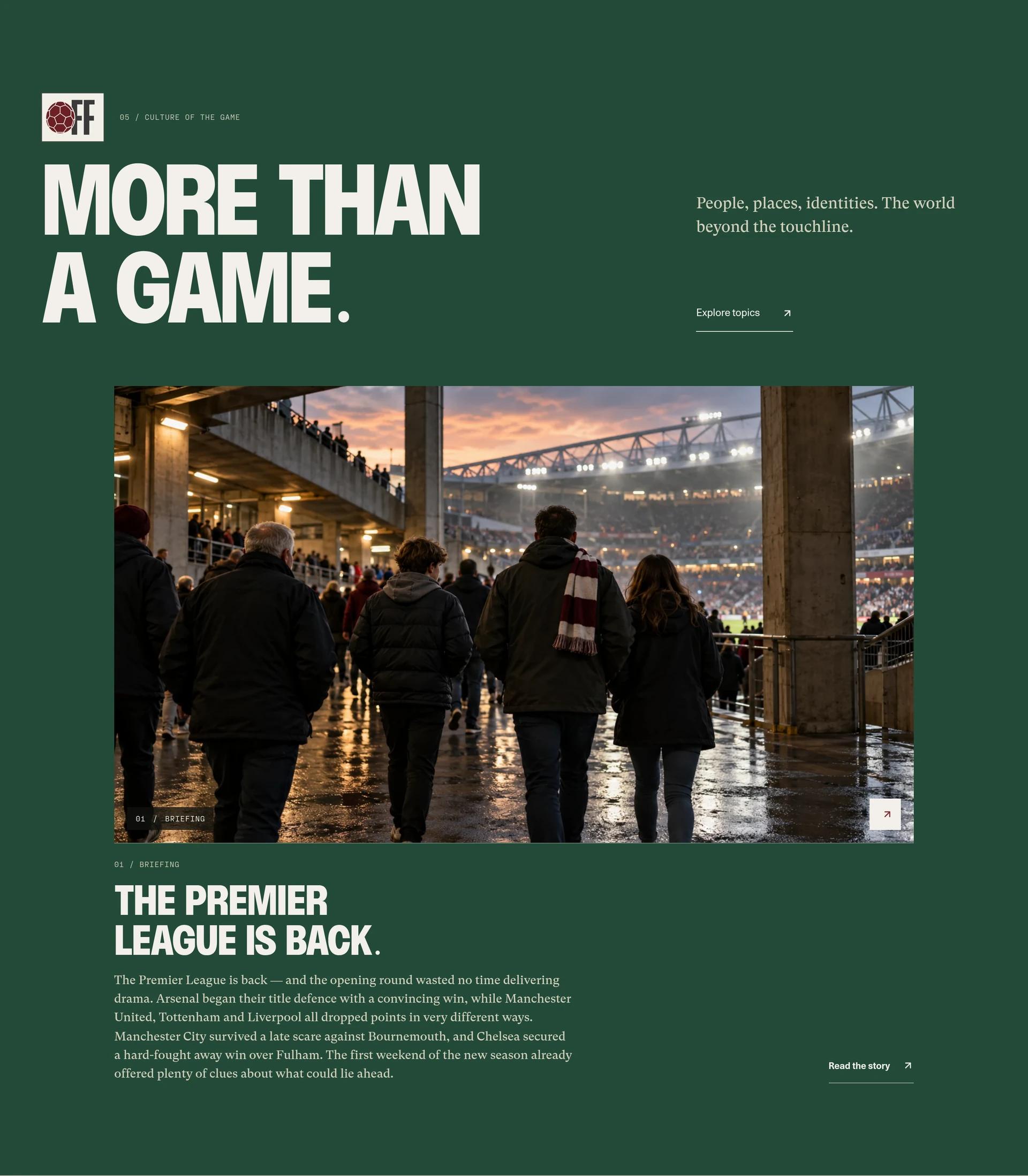
A Cover That Opens Into Culture
PP Monument Narrow carries headlines and chapter openings. GT Super Text takes over for prose, Unica77 handles the interface, and Druk gives sporting numerals their own weight. The hierarchy lets a large culture statement become a quiet reading page without losing the same publication.
CUE 04CRAFT
Continuity Without Delaying the Story
GSAP and one persistent Lenis owner coordinate the cover, photographic chapters and route handoffs. Selected media carries its crop into the next surface; menus and utility routes have shorter gestures. On narrow screens the imagery becomes directly readable, and reduced motion keeps the content available.
CUE 05OUTCOME
The New Edition, in Staging
This case documents the new reboot at its staging address. The Vinext and Cloudflare application preserves bilingual editorial routes and separates publication content from demonstration football and commercial services. The staging edition is the reference here; the old crest-and-gold website is no longer the visual evidence.
STACK
- APPLICATIONVinext / React / TypeScript
- DATASanity content contracts
- INFRASTRUCTURECloudflare Workers / R2 media contracts
- TOOLINGGSAP / Lenis / Tailwind CSS
- TESTINGVitest / Worker route checks

END OF TAPE